An orange tree that grows with scroll
I wanted the front door of this site to be a place, not a board: something alive, pleasant to walk through, and that never ends. The full story of how I got there — four discarded versions, plant physiology as a source of animation curves, synthesized sound with zero audio files, and everything I had to throw away along the way.
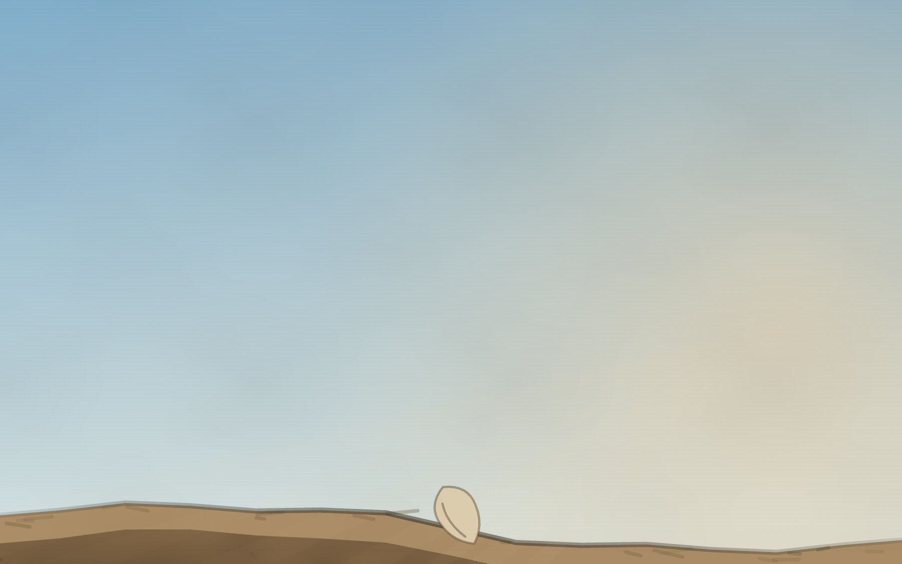
The homepage of this site is an orange tree that grows as you scroll. It starts as a seed, puts down roots, flowers, bears fruit, and the fruit peels open until a seed comes loose and the cycle starts again. There isn’t a single image. There isn’t a single audio file. Everything is generated, frame by frame, with 2D drawing and oscillators.
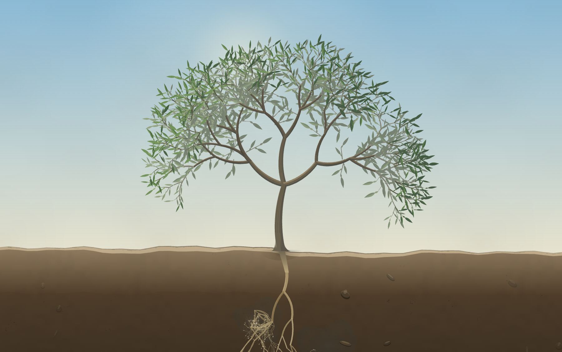
pnpm figures, which drives the piece to an exact p and photographs the canvas.But before the how, the why. Without it, what follows reads like a technical demo, and it isn’t one.
A personal site is not a board
The previous version of this site did what almost all of them do: here’s my experience, here are my projects, here’s my contact. Tidy, correct and still. I’ve written this before: a portfolio is a snapshot, and my work is not.
The problem is that what I do every day looks nothing like an information board. It looks like a process: something that grows, changes shape, gets pruned sometimes and branches other times, that has stretches where nothing seems to happen and stretches where everything happens at once. A board can list that work. It can’t convey it.
I wanted the front door to have that texture. To feel fresh — alive, moving, made now — and to be pleasant to walk through. That second requirement is the one almost nobody sets for themselves. It’s not about informing you faster: it’s about making you want to stay, to scroll a little further to see what happens next. A personal site is the closest thing to inviting someone into your home. It can be a hallway with signs on the walls, or it can be a place where it feels good to be.
Two rules came out of that, and they governed everything else:
- Nothing static. If something can be derived and drawn, it gets derived and drawn. Zero images, zero samples. Everything you see and everything you hear is generated while you scroll.
- Walking through it has to feel good. Every time a technical decision and a feel decision fought, feel won. You’ll see that pattern repeat in every part of this post.
Why a seed
The subject is missing, and it isn’t decorative.
A seed is not what you have today. It’s the potential of what it could become. And that potential doesn’t run out: a seed makes a tree, a tree makes fruit, fruit makes another seed. There’s no point where it ends — it’s infinite by construction.
That’s exactly what I wanted to say about work. A finished project isn’t an ending: it’s a simple idea that became available to grow again somewhere else. Today’s features are tomorrow’s projects’ seeds.
That’s why the piece doesn’t end. The loop isn’t an engineering trick to save on content — it’s the only honest way to close something that doesn’t close. Reaching the bottom of the page and discovering you’re back at the top isn’t an effect: it’s the whole statement.
Everything that follows — four discarded versions, plant physiology, oscillators, tests without a browser — is the search for how to hold those three things at once: make it dynamic, make it good to walk through, and don’t let it end.
Fair warning: it’s long. The piece took weeks, and the interesting part isn’t the result, it’s what kept dying along the way.
Part I — Four attempts
Every version threw away something fundamental from the one before. The progression wasn’t “adding features”: it was discovering that something that looked solved wasn’t.
| # | What it was | What died on the way to the next one |
|---|---|---|
| 1 | A forest growing on horizontal scroll | The direction: horizontal wasn’t intuitive |
| 2 | Vertical descent through mountain layers | The cache: the elements were frozen |
| 3 | The life cycle of an orange tree | The single ending: no user decision |
| 4 | The cycle branches and closes | Choosing with the mouse (spoiler for Part II) |
Attempt 1 — The horizontal forest
This is where the one idea that survived all four versions came from, and it’s still alive today:
Scroll doesn’t drive animations. It drives a single variable, p, from 0 to 1. Everything else is derived: the time of day, the camera position, the growth of each plant, the color of the sky.
p += (target - p) * (1 - Math.pow(0.0015, dt));
That lerp over scroll is 80% of the feeling of quality. Never use raw scroll: the ~200 ms of soft lag is the difference between “a page with parallax” and “something that feels good”.
And this is also where the first big mistake lives, the one that took me a whole version to see: I cached every tree as a bitmap, one per growth step. Blazing fast. And completely dead. The tree grew, but it didn’t breathe.
The obvious optimization and the feeling of life are in direct tension. A cached bitmap is 50× cheaper than recomputing geometry, and it looks 10× worse.
Attempt 2 — The vertical descent
Vertical matches the direction of the gesture, and with mountains and rivers it’s more natural. But the real ask was different: that the same elements animate, move, grow and transform. That forced the cache out.
The architecture that replaced it: every plant became a flat array of nodes with a parent index, where the parent always precedes the child. That lets you recompute every accumulated angle in a single forward pass, per frame:
A[i] = A[parent[i]] + relativeAngle[i] + wind(depth, t, phase);
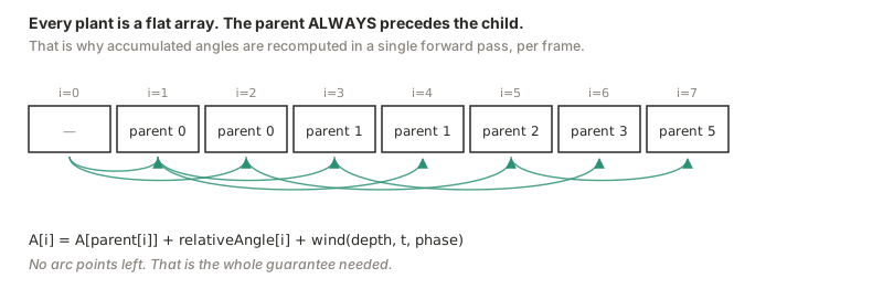
The detail that makes the wind look real: it scales with (depth / total) ** 1.6. It accumulates toward the tips the way it does in a real tree — the trunk barely moves, the leaves dance.
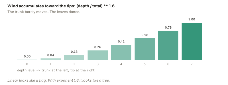
How not to die of draw calls: group every segment by depth level and issue a single stroke() per level, not one per plant. From ~60 calls per tree down to 7.
Attempt 3 — The orange tree
This is where the ask that changed everything showed up: research the life cycle of oranges properly first — every stage and every detail — and only then reflect it.
Researching before designing produced better software decisions, not just better content. That’s the thesis of this post, and here’s the evidence.
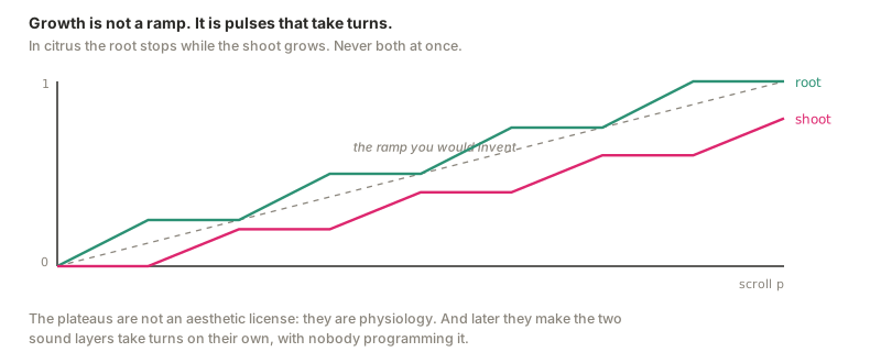
1. Growth is not a ramp. It’s pulses that take turns. In citrus, root growth stops while shoots grow, and they alternate cyclically. The tree never builds both at once.
The growth curves stopped being ramps and became staircases with alternating plateaus. It’s a better easing curve than anything I would have come up with by inventing, and I didn’t invent it: I copied it from physiology. Later on, that same alternation is what makes the sound layers take turns on their own, with nobody programming it.
2. Citrus seeds can’t wait. They’re recalcitrant: they die if they dry below ~25% moisture. No dormancy, no seed bank. Germinate or die. Translated: the initial fall has no dramatic pause. It hits the ground and starts.
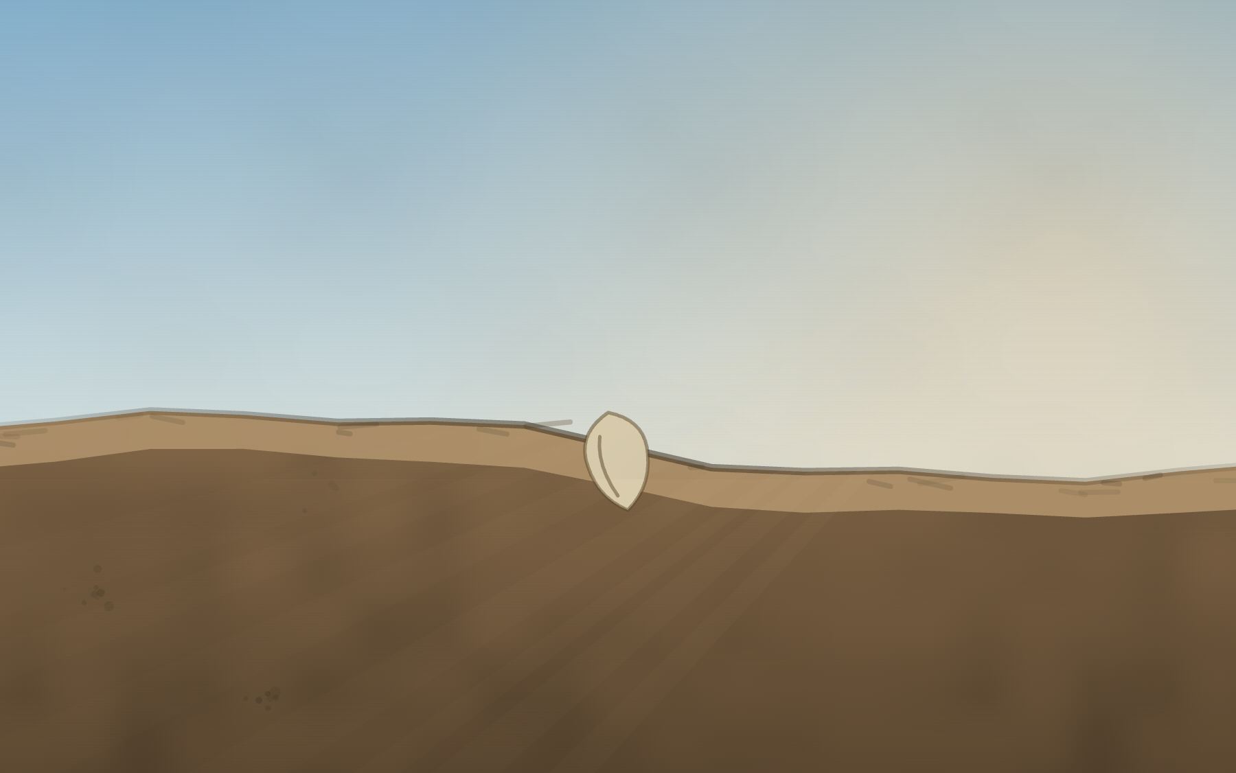
3. One seed produces several shoots. Polyembryony: 2.9 to 4.6 embryos per seed in Valencia oranges. Most are nucellar clones of the mother; usually only one is new. Translated: four radicles sprout, three stall and fade.
4. 98% of the flowers drop — and they leave a mark. Less than 2% make it to harvestable fruit. But here’s the detail worth gold: in June drop, the fruit detaches at zone C, between fruit and calyx. The calyx stays on the tree. Translated: after the drop, empty little green stars are left all over the canopy. It’s the kind of detail nobody can name but everybody registers.
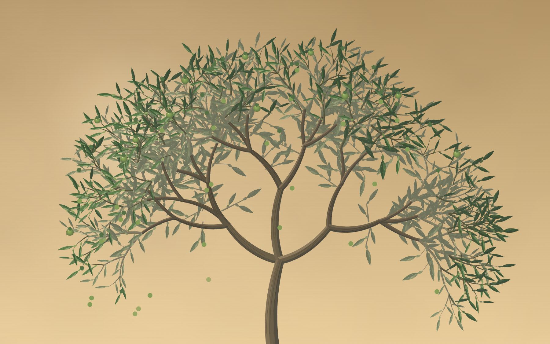
5. The orange was always orange. Cold nights degrade the chlorophyll in the rind and reveal the carotenoids that were already underneath. In warm climates the fruit stays green even when it’s perfectly ripe. Translated: the color doesn’t advance with scroll. It advances one step per cold night that passes in the scene.
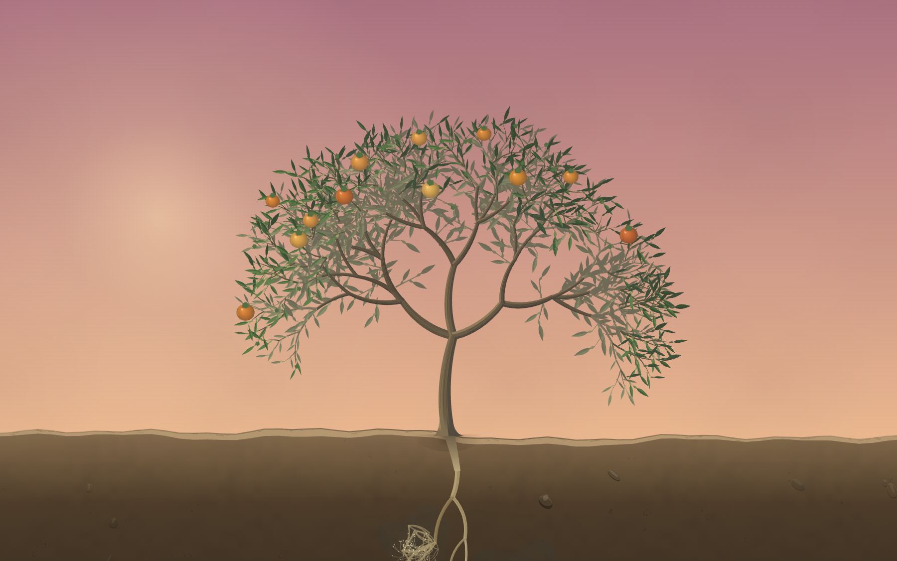
And a bonus, for the leaves: a citrus leaf isn’t simple, it’s unifoliolate — a compound leaf reduced to a single leaflet, with a winged petiole and a visible joint. Plus oil glands that read as translucent dots.
Attempt 4 — The cycle that branches
The metaphor stretched until it closed:
| Element | What it stands for |
|---|---|
| Orange | A project |
| Segment | A feature |
| Seed | A simple idea |
| The repeating cycle | That idea can grow again |
The detail that makes it land: ideas are a shared pool across projects. “Write it down” shows up in one project’s Review checklist and in another’s Audit trail. It isn’t a content bug — it’s exactly the thesis: everything is made of the same simple pieces, assembled differently.
And this is where the invisible loop was born, the only thing from this version that reached the end intact:
The final stretch of scroll (p from 0.95 to 1.00) renders exactly the same pixels as the opening stretch. When you hit the bottom, scroll jumps to p − 0.95. Since both stretches render identically, the jump doesn’t change a single pixel. You scroll all the way down and, without noticing, you’re back at the top.
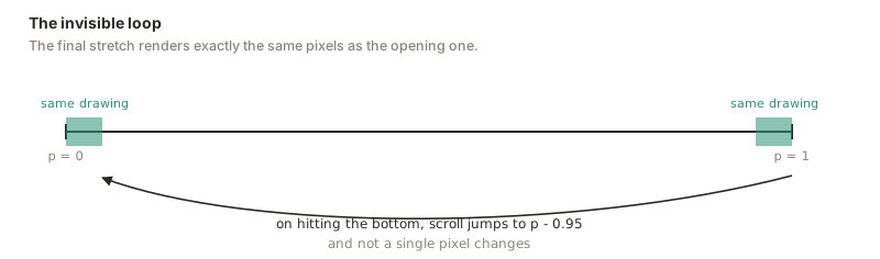
It’s a cheap trick to write and an expensive one to sustain, and that’s the point: it forced everything else to be coherent. If the sky doesn’t land on exactly the color it started from, you see it. If the seed doesn’t land exactly where the next turn begins, you see it. Any ordinary ending forgives the mismatches you accumulated along the way; a cycle forgives none of them. A good share of the corrections in Part II exist because the loop exposed them.
In this version, mouse position decided which fruit and which segment opened: 15 possible endings, 3 fruits × 5 segments. Hold on to that number. It dies in Part II.
Part II — From exploration to piece
Up to here it was an exploration: one file, zero dependencies, 45 KB. What follows is turning it into the homepage of a real site, and that’s where most of the certainties collapsed.
The migration: React keeps the page, the engine keeps the pixel
| what | who |
|---|---|
| Structure, content, order, accessibility | React |
| Stage, age, note, light/dark scheme, accent | React (state) |
| Band opacity, rail dot, flash | the engine (by ref) |
| The 44,000 draws per frame | the engine |
A canvas frame is not a tree of elements: it’s a sequence of opaque writes onto a context, and between one frame and the next there is nothing to reconcile. Declaring it in JSX would add a layer that describes nothing and charge you a reconciliation per frame in exchange. That’s why the engine is still the same imperative code that used to run inside a <script>.
What the migration did win is everything that was written twice: band ranges stopped being data-from="0.085" read with querySelectorAll + parseFloat, and the accessible project list now comes out of the same catalog that draws the canvas. Before, they were two hand-written lists that could diverge without anything warning you: adding a segment to the drawing added nothing for a screen reader.
And destroy() isn’t tidiness. StrictMode mounts, unmounts and remounts every component on purpose: without it you get two animation loops fighting over the same canvas from the very first boot.
Giving the drawing some matter
In the same pass, three problems you only see by looking, not by reading code.
Lines that were too perfect. The roots were traced with plain lineTo — straight polylines with elbows, right in the phase that narrates hydrotropism: the text said one thing and the stroke denied it. The trunk was born on the exact vertical, and branch curvature was a bare sin(ph) * 0.052, so any branch with ph near a zero came out perfectly straight — and the trunk was one of those.
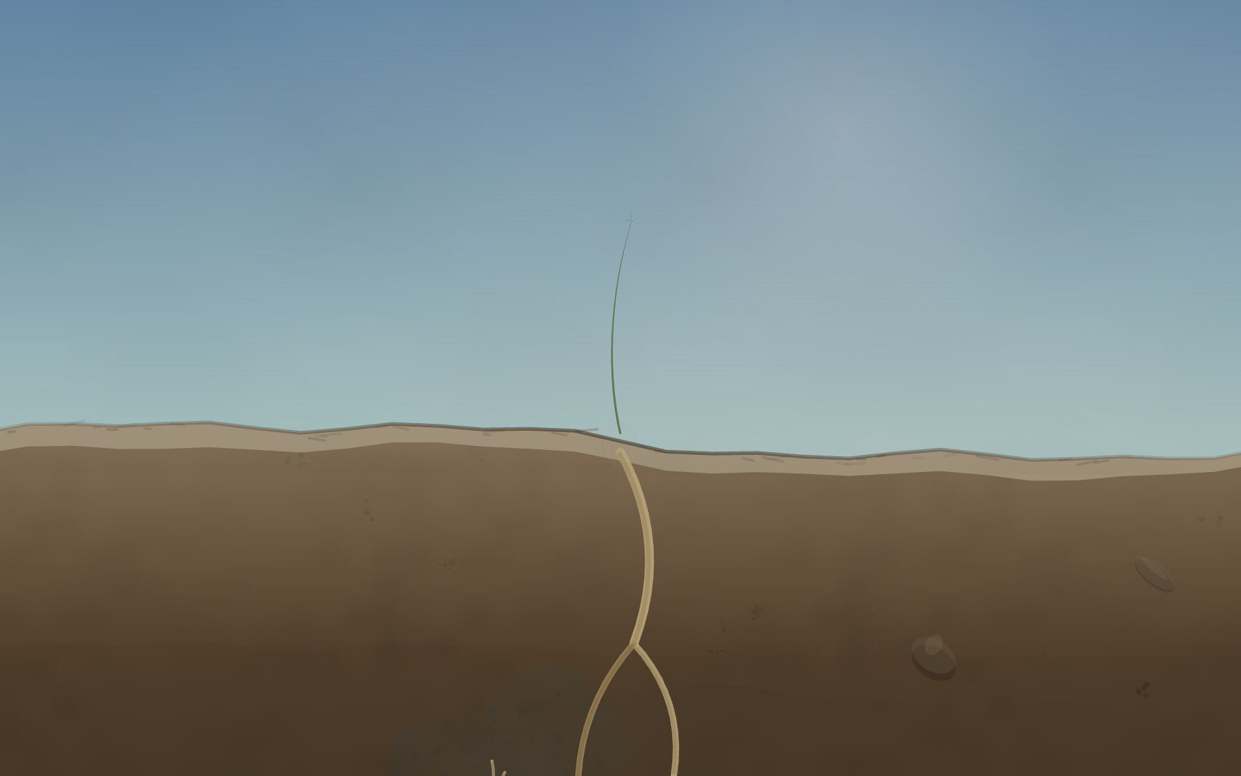
lineTo: straight polylines with elbows, right in the phase that narrates hydrotropism.Texture. Grain as high frequency over low, each in its own space: paper grain in screen space, pigment pooling in world space. Edge darkening where a wash dries. Line weight loaded on the shadow side. Lost edges toward depth, which also dissolves the wire cage the background roots used to read as.
And one rule held to the letter: none of the new variation comes from r(). All of it derives from ph, from the index, or from a constant, so the topology of the tree and the roots didn’t move a millimeter.
The text: two failures and a specimen label
The text falls on a canvas that changes color with the time of day. There is no ink color that works over a noon sky and over shadowed soil. I tried the two usual moves and both failed:
text-shadowwith a halo thickens the outline of every letter and muddies the typeface’s drawing, especially at large sizes.- the scrim — the gradient layer that established practice recommends for text over imagery — reads as a smudge floating on top of the drawing. With its own shape and without it. There’s no tuning that fixes it, and the reason is exact: it has no surface. A patch that fades out isn’t an object, and the eye registers it as a printing defect before it registers it as a background.
What does have a surface is a label. A specimen sheet doesn’t solve text by covering the drawing: it gives the text its own card of paper, resting on the sheet. The convention is two hundred years old and it is literally this piece’s language. Contrast stops being a blending problem and becomes a materials problem: there is paper, and on top of the paper there is ink.
Three details make it read as a paper label instead of a UI component: no border-radius — a paper card is cut with a guillotine — opacity .97 and not .94, because six hundredths let the drawing show through and bring the smudge problem back, and its own grain, because if the labels come out perfect and smooth on a grainy sheet, that perfection is what gives them away.
Bodoni Moda and Newsreader left too, for the same reason as the text-shadow: they’re high stroke-contrast typefaces, and over a background that changes, thin strokes disappear. Fraunces and Source Serif 4 came in.
The corrections pass (or: when the best idea dies)
Everything below came from watching the piece run and writing down what looks wrong. The diagnoses come from zoomed screenshots, not from reading code.
Choosing with the mouse is gone. It survived a whole version and it was the ending of attempt 4. The diagnosis: it wasn’t interaction. There was no way to know it existed, there was no state, there was no undo, and the result led nowhere. The turn replaces it: each cycle opens another project and another segment, with a step that doesn’t divide into five so the pair doesn’t repeat too early. Scroll stays; that was never in question.
In the same move, Cue left — the sign that asked you to move the mouse. A sign that invites you to do something that does nothing is worse than no sign at all.
The canopy was hollow. There was one leaf per terminal node, and in a seven-level tree every terminal sits on the perimeter: you got a crown of foliage with a bare skeleton inside. Now leaves are born along the shoot with density proportional to its length, and shade leaves come out larger, flatter and older.
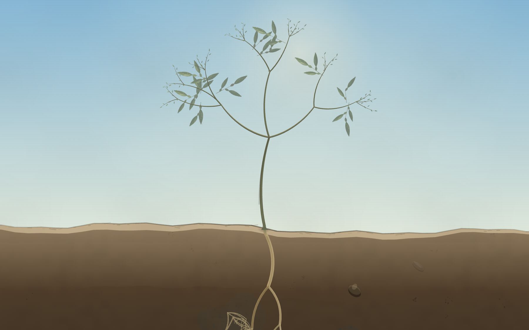
Even so the center stayed empty, and there the problem wasn’t leaves, it was wood: the tree fans out, with thirteen level-3 branches against a hundred and sixty-one twigs at the edge. Interior shoots were added — what citrus pruning calls a water sprout when it runs long — with their own generator, so the tree I already had wouldn’t change a single branch.
And here I correct myself. In the exploration I had declared an artistic license: 3 of 46 flowers survived, which is 6.5%, not the real <2%. The reasoning was wrong, not the number. The 2% fruit set is measured against the tree’s real flowers, which number in the thousands; applying it to the forty-six drawn ones is counting the same pruning twice. Now there are nine fruits, and there’s no license to declare.
The climax had three jumps, each with its own cause:
- The orange on the tree kept drawing while the interior phase painted another one on top of it.
- The peel had a straight tonal step crossing the fruit: the same continuous surface was being shaded with two models, the spherical gradient below the peel line and incidence above it.
- Between the peeled fruit in profile and the rosette of carpels there were two different projections spliced by opacity. The relationship between those two views is a 90° rotation about the horizontal axis, so it gets drawn: the albedo’s septa turn out to be the same radii that separate the carpels, and by the time the albedo opens there’s nothing left to splice.
And the loop lost its flash. There was a white flash covering the seam, and covering the cut meant losing the one thing the piece wants to say. Now the seed that comes loose from the segment travels and lands exactly where the next turn begins: same position, same size, same rotation. For that, the last stop of the sky cycle had to match the first one — that fifteen-luma-level difference across the largest surface in the frame was what the flash was hiding.
The peeling, for real
The previous version slid eight annulus sectors outward. It worked like slicing a cake: the skin never broke, never folded and never showed its inner side.
Now there’s a peel line running down the fruit. Below it, the skin is still attached and sits exactly on the sphere. Above it, it’s free: it leaves along the tangent and follows a constant-curvature arc whose length is exactly the skin already released, so it neither stretches nor shrinks. The orthographic projection of a gore seen from the side is literally x = u·sin ψ, y = −v: the (u, v) pair the deformation computes in the meridian plane is already the drawing. The only thing left to add is paint order by z.
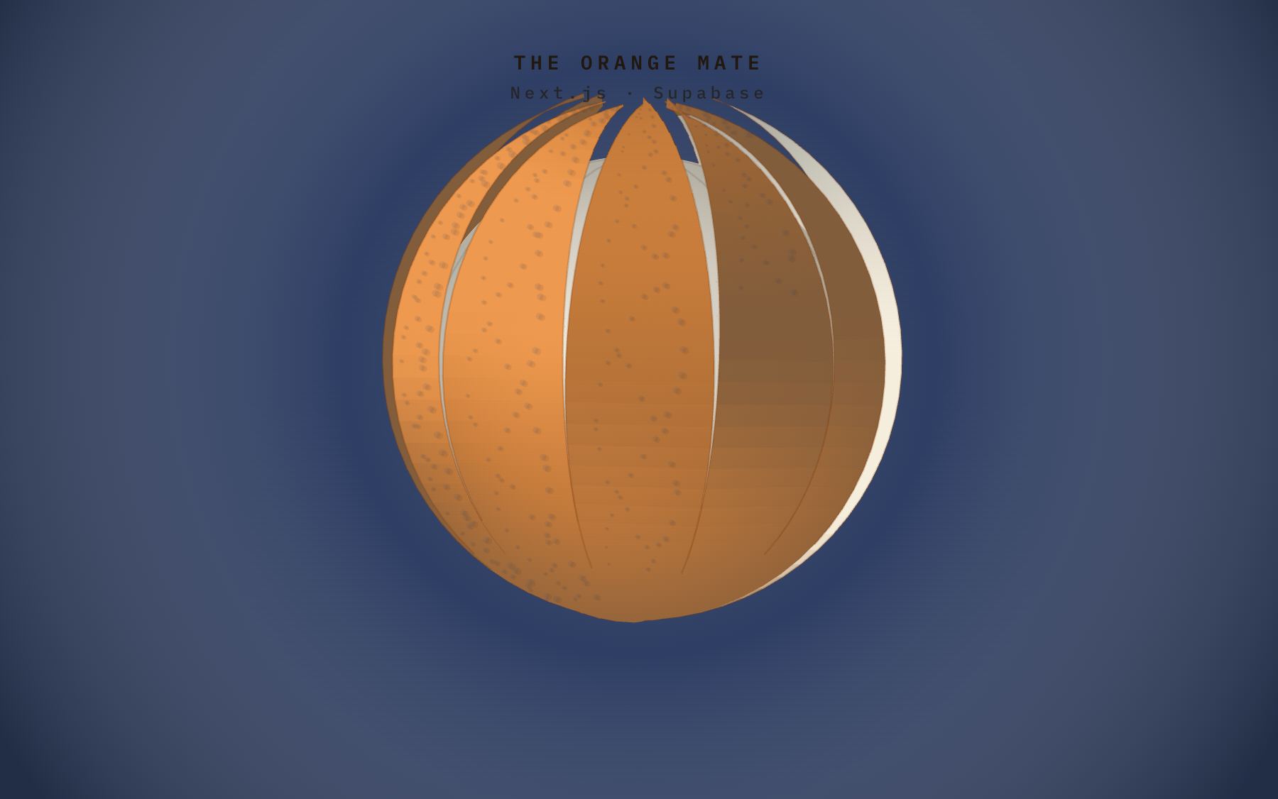
Then the rind falls — it doesn’t fade — and the albedo opens from the center — it doesn’t fade either. Both for the same reason: dropping alpha exposes the internal seams, and a 50% white veil over the pulp sends the oranges to gray in the single most important frame of the piece.
And the albedo doesn’t open with a circular hole: it tears along the septa, which is where the fruit was already divided. With threads, too, because albedo is a mesh of cells with air pockets, not a membrane: it doesn’t separate along a line, it separates into strands that cross the opening and snap one at a time.
Performance: measure before you write
The piece adapts to the machine instead of assuming one.
- Startup calibration: it draws 420 leaves onto a scratch canvas, before the first frame, and measures cost per command. Cost per pixel can’t be measured from the main thread — filling the screen three times measures zero, the GPU rasterizes it — so that side gets an arithmetic ceiling rather than an invented forecast.
- Watchdog: it counts dropped frames over a wall-clock window, not a running average. It gives up resolution first, thins the canopy second. It never goes back up: down-and-up makes the canopy pulse.
- LOD by fraction of leaves, not by threshold: all 1,254 leaves cross the threshold together, so raising it would kill the venation of the entire canopy from one frame to the next. The expensive part of a leaf is the blade, not the venation (12.8 ms against 3.1 in silhouette), so the reduction flattens instead of removing detail.
Plus one exact cull, which is not a quality reduction: the roots were being drawn with the ground off-frame, 10.6% of the frame at p 0.60.
| Full run | frames over budget |
|---|---|
| 1440×900 unthrottled | 0.3% → 0.0% |
| 2560×1440 | 6.8% → 0.5% |
| 1440×900 with 4× CPU throttle | 12.7% → 5.5% |
Part III — The piece makes sound
All synthesized: not one audio file gets in, the same way not one image gets in. A sample bank would have been the only external input in the work.
The underlying constraint is the same as the drawing’s, and here it’s more expensive to get wrong: the piece doesn’t run on time, it runs on scroll. The reader is the playhead — going forward, going back, stopping dead, or swallowing three stages at once — so there is no linear track to be had. Two rules come out of that: p moves a state and never a playhead, and nothing is generated per-sample live (noise is baked once into a buffer and looped by the audio thread; the main thread never finds out).
The gate
An AudioContext created before a user gesture is born suspended, and scroll doesn’t count as a gesture in Chrome. The technical constraint and the design decision point the same way: a toggle floating in a corner is an accessory stuck onto the piece; a gate is the piece beginning.
The beds
Four continuous layers of baked noise — soil, air, insects, night — with gain and filter hanging off p. The wind’s bandwidth comes from the size of the canopy: the same curve that thickens the tree opens the filter. The reverb is a synthesized impulse response and runs as a send, not an insert, so the soil sounds dry and the air sounds wet.
The music
An electric piano repeating a motif with its rhythmic signature while the harmony underneath changes, which is the method of Hiroshi Yoshimura’s Music for Nine Post Cards. The motif is stored as chord degrees, not notes, so the same figure lands over any chord.
Rhodes and not a grand piano, out of honesty: a believable acoustic is twelve or sixteen inharmonic partials per note plus sympathetic resonance; a Rhodes is three oscillators, and it’s the instrument of that record. Peaks and troughs come from two arcs of incommensurable lengths, and the dynamic peak lands on the harmonic one on purpose.
The facts of the world: from event to state
This is the biggest correction in the whole piece, and it’s the same lesson as attempt 1’s cache, in another domain.
The first version fired a sound when a threshold was crossed, and ran it against the audio clock. Once launched, it no longer cared where the reader was. Scrolling slowly, it finished and the rest of the animation went mute; scrolling fast, it fell behind; and scrolling backward, nothing played at all. A trigger has no reverse.
Now a transformation isn’t an event: it’s a state. Fourteen layers whose gain comes from how much the thing is moving right now. If the reader stops, the fiber keeps giving way for half a second and dies on its own. If they scroll back, it sounds the same — the rind going back on makes the same noise as the rind opening, because it’s the same fiber rubbing.
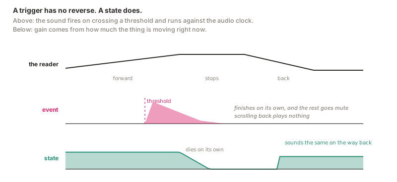
For that, the engine had to learn to count how much each thing is moving: sig went from ten signals to fifteen. The two interesting ones are bud and leaf, because they aren’t the size of the tree but how much activity there is right now. They’re computed with eight steps per frame, one per depth level, instead of walking the twelve hundred branches.
Two details make it work:
- Speed is normalized by the length of each transformation. The root takes 0.59 of
pto grow and the fruit takes 0.018: with the same scroll, the fruit’s signal moves thirty times faster. Without correcting for it, the peeling blows up and the root can’t be heard. - It uses the derivative of each signal, not of the scroll, because growth curves have plateaus. And here the circle closes with Part I: citrus grows roots or shoots, never both, so the two sound layers take turns on their own without anyone programming it. The physiology that gave me the easing curves ended up giving me the mix automation too.
The timbre, which was what made it muddy
- Every grain carries a Hann window. They used to attack with a four-millisecond ramp — basically a step — and a step has a flat spectrum: a hundred of those per second don’t sound like leaves, they sound like white noise.
- Grains are high-Q resonators, not wide bands. Low Q is wind, and low Q in the bass is thunder — which is literally what the approaching orange used to be.
- Sizes follow a power law, like anything that crackles. Uniform, a hundred grains sound like a machine repeating the same thing a hundred times.
- Textures are tuned to the chord the piano is playing, so the world stops competing with the harmony and becomes part of it. The peeling and the albedo are left untuned on purpose: a rind breaking has no musical pitch, and that contrast is what makes them read as facts.
Levels were calibrated by measuring how far each layer lifts above the floor, not by ear. Three were below it.
Part IV — Making it an actual portfolio
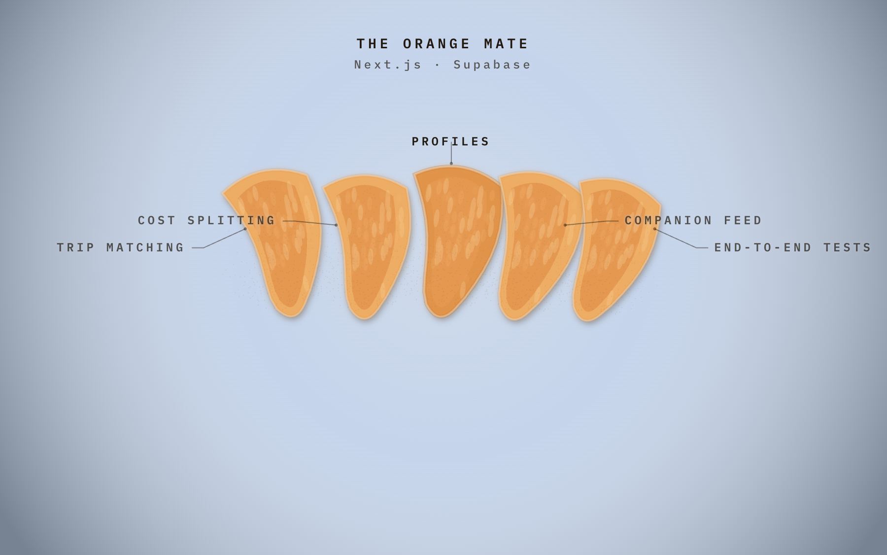
The placeholder text is gone. The six named fruits in the canopy are the six published projects, and they come from the same array that draws the canvas: name, stack, segments and repo URL. How many fruits the tree hangs is derived from PROJECTS.length, so adding a project is editing that array and nothing else.
My day job isn’t among the fruits, on purpose. It isn’t something you cut open; it’s the tree you keep tending. It lives in the Currently band.
And every segment learned to explain itself: hovering the pointer over a carpel, the sheet writes at the foot what that piece of the project is, letter by letter, with the ink bleeding before the stroke. Between one segment and the next the brush lifts: the old text withdraws, there’s a gap, and only then does the new one start.
Three decisions worth more than the effect:
- Pointer hit-testing doesn’t go through the event. The event stores two numbers; the frame decides which segment is being pointed at, using the geometry it just drew and read from the context matrix. A parallel computation desyncs silently, and a desynced hit area responds where there’s nothing.
- Pointed at is not chosen. The pointed-at one only lightens; the chosen one keeps its pulp. Sharing the color promised an opening that hover doesn’t perform.
- The pointer doesn’t decide. It asks. The choice still comes from the turn, not the mouse — the lesson from the corrections pass wasn’t undone to fit in a pretty effect.
Accessibility
The canvas is aria-hidden and a dimmed label sits at visibility: hidden, so without a parallel text block a screen reader finds only the currently lit band and a search engine finds nothing. TextIndex is the readable version of the whole page, and the segment glosses live once, in the catalog, used by both surfaces.
The social card
og.jpg is not a mockup. It’s a real canvas frame at p = 0.78 — color break, at night, with the tree loaded and the roots in view — with the title injected as DOM and photographed together with the drawing. That’s why it uses the same fonts as the piece and not an approximation that misaligns itself the first time someone touches the typography.
It’s manual on purpose: thirty seconds paid once per change, against booting a browser on every build.
The phone
A phone held upright has no margins, and the piece was composed like a specimen sheet: the drawing in the middle, the labels in the margins. A label at a readable measure takes up the entire 390 px width, so the text didn’t sit beside the drawing — it landed on top of it.
It gets split by height, which is the only thing a phone has to spare: drawing on top, text below. And for that, the drawing yields the space instead of fighting for it — a single entry point, reframe(), with the world’s vertical anchor, a scale multiplier applied exactly once, and the strip where the text lives.
And over a strip the camera deliberately leaves empty, there’s no drawing to cover: the paper stops being necessary and contrast is solved by the same light/dark break that already keeps the wordmark and navigation legible. The desktop solution wasn’t universal; it was an answer to a question that doesn’t exist in portrait.
The reframe exposed two bugs that had been hiding for months:
- The view box was derived from the center of the screen instead of the anchor. Raising the anchor left it short at the bottom and the ground ended before the screen did: you could see sky below the soil.
- The scroll hint never went away.
animation: ... bothretains its final state forever and beat the exit class: with no transition there’s notransitionend, so the node stayed mounted.
And the scroll debt got bounded. With a finger, scroll is a fling and the browser keeps going on its own: a 20,000 px jump left the piece playing by itself for 6.8 s after release. Now 3.8 s.
The deployment
The piece is the front door of the domain: it keeps the root and hands everything else — /blog, /projects, /resume — to the Astro site, which lives in its own repo and its own Vercel project. One single rule:
{ "source": "/:path+", "destination": "https://<alias>/:path+" }
:path+ requires at least one segment. That’s why / stays on the piece’s side and everything else falls to the other, without enumerating routes: a new blog post works without touching that file.
And the direction isn’t interchangeable. Vercel resolves the filesystem before rewrites, so if Astro owned the domain, a rewrite from / to the piece would never fire: its index.html exists and wins. Whoever serves the root has to own the domain.
How to test an animation without opening a browser
A canvas animation looks impossible to test without eyes. It isn’t. You can fake the context in Node and capture the full sequence of drawing calls:
const ctx = new Proxy({}, {
  get(t, k) {
    return (...args) => log.push(k + '|' + args.join(','));
  }
});
Five tests run on that. The three originals:
- Loop identity. Freeze time, turn on
prefers-reduced-motionso the render is a pure function ofp, and compare the call sequence at six pairs of mirrored positions. Identical, down to the last call. The loop is invisible by construction, not by luck. - Full sweep. 2,400 frames end to end. It catches runtime errors at any scroll position and measures cost. It found a real crash: a bucket array sized to 7 when the roots reached depth 8.
- Branching. Verify the ending actually branches.
And one thing changed: the piece stopped being a function of p alone. Which project opens depends on how many turns you’ve done, and that’s deliberate. The carryover test now compares two instances with the same number of turns reached by different paths — which is where any accidental carryover would still show up — and checks rotation separately. The branching test used to exercise the mouse; now it proves that the idea each turn carries forward is exactly the first seed of the segment that opened.
When the design changes, you don’t delete the test: you change its question.
What I learned
The cache was a premature optimization that cost a whole version. And its twin in audio — the threshold trigger — cost another full iteration. Both times the mistake was the same: modeling as instantaneous something the user controls continuously.
Zoomed-screenshot diagnosis finds things that reading code doesn’t. Almost every defect in the drawing had a geometric cause you can’t deduce from the source.
Measure before you tune. The three oranges in attempt 4 sat at 40%, 44% and 59% of screen width: choosing by mouse was physically impossible, and without measuring I’d have eyeballed the fix three times over. Same with the tree against the framing, and with the audio levels against the noise floor.
If you’re going to bend a fact for legibility, say so in the piece, not in the post. And before you declare the license, check whether the number was misapplied — the 2% fruit set turned out to be exactly that.
A sign that invites you to do something that does nothing is worse than no sign at all.
Numbers
| measure | value |
|---|---|
| Tree nodes | 396 |
| Root nodes | 732 |
| Leaves in the canopy | 1,254 |
| Twigs at the edge | 161 |
| Flower sites → fruits | 46 → 9 |
| Signals the engine publishes | 15 |
| State-driven sound layers | 14 |
| Nights in the cycle | 8 |
| Draws per frame | ~44,000 |
| Image files | 0 |
| Audio files | 0 |
The thesis
A subject’s constraints are a source of design, not a limit.
I didn’t invent how the tree should grow: I read it. The alternating pulses, the 98% drop, the calyx that stays, the color that was already there. Every fact settled a design decision I would otherwise have had to eyeball — and I’d have gotten it wrong. The root/shoot alternation from citrus physiology ended up being, at the same time, my easing curve and my mix automation. I don’t come up with that on my own.
And the other thesis, the one that was there before the first line of code: a personal site can be a place instead of a board. This whole machine — curves copied from physiology, grains with Hann windows, paper labels, the phone reframe — exists for one thing, which is that walking through it should feel good. Every time technique and feel fought, feel won. The bitmap was faster and it lost. The threshold trigger was simpler and it lost. The flash covered the seam and it lost.
The goal of the piece is simple: that someone reaches the bottom of the page, realizes they’re back at the beginning, and scrolls down again. That they leave with the idea that none of this is finished — not the tree, not the site, not the work. A seed is never what you have today.